Showing posts with label 1990 buffalo. Show all posts

Saturday, July 17, 2010

Box Set

Wide Margins: An Exhibition of 'Zines and Self-Published Works from the Sublime to the Silly is currently on view at the WNY Book Arts Center. It runs from July 16-September 3, 2010 & includes hundreds of home-made, self-published works of literary and graphical self-expression. Zines were the blogs before the internet. They were made with typewriters, glue, scissors, tape, copy machines, old computers, press type, pencils, paper, markers, photos, stats, stickers and often staples.

Both my 1990-era pubs -- the Sign O' The Times (SOTT) and Slack Magazine, done by Wizard Graphics-- are highlighted in a glass display case. Thanks to WNYBA's Amy & Jessica for curating this super show. This is really a fine collection of hanging, stacked and piles & piles of literally a shit load of publications. Make sure you get down before Sept. 3 to check this show out- it is very cool!

I missed the opening reception as I was out of town, but I biked down the Saturday afternoon to check it out. I was pretty psyched to see the show. I took these snapshots -- heavy on the Wizard Graphics case -- for your viewing pleasure.

HELPFUL LINKS-
Facebook page-
click. BuffaloSnooze preview- click. WNY Book Arts page- click. Slack Magazine online website.


The full Slack & SOTT case. Click on this image collage for big view....very nice. This display includes tee, Slacker in Space original comic art in stat & negative form, a poster, business card, watch, rubber stamp and original issues of SOTT and Slack Magazine.


Side view of full SOTT- Slack case- protected under glass!


Edits to Issue #1 of SOTT includes hand notes on laserprint proof.


Poster for Slack fundraiser at 3rd Room & one-of-a-kind original SLACK watch.


Various SLACK Magazines with Slack in Space comic by Don Keller.


SOTTs from 1991.
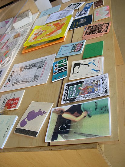


Zine case 01- colorful, fancy zines.


Zine case 2- very professional looking zine-age.


Hanging row of the great Duplex Planet zines.


More colorful Duplex Planets.


Hanging zines and tools (electric typewriter & 'pre-zine' print press).


Beer Frame- a classic from back in the day.


Artbabe!!


Stacks-o-Zines.


Event posters in WNYBAC window on the corner of Mohawk & Washington, Downtown Buffalo, NY.


Saturday morning, post opening party clean up.


BONUS BEATS- WNYBAC is a great addition to the Queen City -- they have been around for one year now. Please support this non-for-profit if you are a fan of the printed arts-- especially the antique hand-made, letter-pressed versions of book and all things printed. Become a member!

Wednesday, May 26, 2010

Who Loves The Sun

Cool It Down -- Twin Fair, 8-Tracks and the missing CDs, that one's that really hurt...


I think back about all the CDs I used to own that were stolen, borrowed and never returned, disappeared after a party, you moved out-of-town and you traded them to me in exchange for your share of the utility bills, and the otherwise misappropriated. The ones that you remember most are the ones you really miss.

Of the first 2 cds I ever bought -- LL Cool J's "Bigger and Deffer" and B.A.D.'s awesome first record, "This is Big Audio Dynamite"-- only the BAD remains in my collection. Kinda sucks not to have the first 2 cds I ever owned. Not for nostalgic purposes, because they both rocked. I have the first ever record I purchased- 1975's (bought new in 1978) Aerosmith 'Toys in the Attic" (but then again, it might have been Joe Walsh's "But Seriously Folks" LP....). Good one... probably bought at Twin Fair or Cavages at the Boulevard Mall.

I don't have the first cassette tape I ever boughtm and know I don't have the first home-recorded cassette I ever made-- but I do remember it was The Beatle's blue LPs (didn't bother with the red one, for some reason..). I know I don't have the first 8-track tape I ever duped. Before moving all the way to cassettes at an early age, I did have a nice collection of 8-tracks when I was 14-15 years old including Steely Dan "Aja", Cheap Trick "Live at Budakon," Alice Cooper's "School's Out," and the first Boston & Foreigner records. Hey, I was 15 years old.

But I must bring this back to the misappropriated CDs of the past. The ones that really get me, are the CDs I have completely forgotten about. They are the ones that pop-up and make you say "damn, now I have to buy that for a second time...". I have one CD of the 2-CD set New Order "Substance" in my collection... that really burns me, someone stole one half of the collection. Loser. That second one was the good CD too! I am also missing-- and if YOU have them, please return them-- the Cure's "Kiss Me Kiss Me Kiss Me", "LA Woman" by The Doors and/or U2's "Joshua Tree"... I already replace the first two, so on second thought-- if you got 'em, keep 'em!


The real painful ones are the forgotten ones that sneak up on you like this: I recently read the 33-1/2 book about the "Velvet Underground and Nico" LP and decided to dig out the vinyl version so I could burn it to CD (for myself only, of course...). I haven't found it yet, but I know (hope) it is still in the record collection someplace. Then it hit me. I used to have the CD of VU's commercially-pleasing, hit-filled "Loaded" - quite a fine recording, I might say. It's gone... a long time ago. I forgot I even owned it, it has been gone for so long. I probably bought it 24 years ago and owned it for about 10 years of that time. I found a real beat-up and unplayable vinyl copy that wasn't mine to start with... I may have 'misappropriated' this one.... (not on purpose).

But when you have a bunch -- some may say, too much -- music like me, you can get a surprise once in a while. The exact opposite happens. I had a hankering for the live Kinks double LP "Two For The Road," and bammmmmmm-- there it was! Awesome. Then a few mysterious ones will creep in like Electroman's "KookaKook" 12" record... who's was this? Thanks!

Thursday, April 29, 2010

What's Going Ahn

In a world rendered only in back & white, there were few graytones and bitmapped reigned supreme.

I remember the olden days when everything was on black and white (unless it was printed on colored paper stock). Before color printers were all the rage (and affordable), us event-marketing types (aka poster-flyer makers) did all our posters in single color: black on white. Simple graphics for simpler times, they were....

While searching back for some deja blu flyers, I unearthed some rock show flyers I had designed back in the early '90s.

This collection includes:
> 808 State at the ICON
> Ladies Night Saturdays at the ICON
> The Headhunters at Nietzsche's
> A 1991 double bill of The Headhunters & the Steam Donkeys at the Little Harlem
> Gil Scott Heron at the ICON

These flyers were build on a combination of either a band's press photo or something scanned from a magazine-- usually vintage Life magazines or a '90s rock rags like R-Stone-- and some typographic magic. The one up top-- the Double Hoedown (at the Little Harlem, a vintage Buffalo soul & jazz club that burned to the ground and was demolished in 1999) has titles generated in 'Typestyler', an early font manipulation program that was used to create effects now common in ALL graphic design programs. These crazy effects included: drop shadows and outlines. Wow. Heady stuff back in 1990. The graphic computer tricks that seems so basic on computers today, were a byte-churning event back then. Typestlyer was known to take a few minutes-- yes, a few MINUTES- to create a text effect! This DBHD! poster includes a hint at my early obsession of stars on rock posters. I still haven't kicked that habit.

For a band building a reputation at the time on the blips and bleeps of early acid house-techno-- 808 State-- I tried to get 'super electronic & computery'. This flyer was built upon a photo scanned from a science textbook that had some state-of-the-art Photoshop magic -- a noise filter, glow and drop shadows-- added to it. Wow (again).

This other Headhunters poster was a simple one, but it is my favorites from this bunch. Not a lot of computer tom-foolery on this... just a simple closeup of rock legend Chuck Berry lighting a cig, darkened to give it's shadows a bit of a sinister undertone. It had the most basic of event details overlayed in a blocky font. I remember going for something to compliment Terry Sullivan's band's real rock-&-roll sound and I wanted a paste-to-the-wall vintage feel- I think this one has really stood up over time. As the Ladies Night -- with a cleavage peaking, cig-smoking Isabella Rosalinni-- looks dated (Good God Stretched Type! Argggh!!), I think this one and the Gil Scott still look good. They might look nice printed in a 20 x 30 format?

To think these were created on a Mac SE-30, often transferred by floppy disc to my job at a local service bureau and printed to Photostat Paper to create a 'master' hard copy ($8 each). You couldn't print your own-- laser printers wern't all that good back then.... they were printed by the bar owner (or the band) at Kinkos on 8-1/2 x 11" white bond paper. Though I think the futuristic 808 State flyer was printed on neon yellow paper.


Did I get paid well to do these back then? Ha!
No, but I got to see alot of great free rock shows...

Click for larger views:


The Headhunters at Nietzsche's (updated)- Classic rock image for a great Buffalo rock band.


808 State at The ICON (1993)- British electronic comes to Buffalo early '90s.


Double Bill Hoedown featuring The Headhuters & The Steam Donkeys (1991)- Great late night show of local Buffalo bands in an unlikely venue. Nice giant rock hair, Mr. Matt Smith!


Saturday Ladies Nite at ICON w/ DJ Unlimited (1992)- alternative, progessive, wave! club flyer, Buffalo, NY. "Gals," "Girls," "Women" & "Ladies" drink free!


Gil Scott Heron at ICON (1992)- The revolution was not televised, it was live! This was one of those ICON shows where the garage door was open and the side room was filled with folding chairs.

Tuesday, February 23, 2010

Sounds of the City

Looking back on an era of acid jazz and the posters that set the scene.

Things have been rather hectic around the OW headquarters and I haven't had much time to sit back and contemplate or even muster enough energy to write about something. So the blog has suffered as you can see...sorry. It has been a busy year. I thought I would spend some time looking back (while cleaning the flat files looking for something) and post some old graphic design work, some rock posters, some DJ flyers and some of the fun things I have completed over the years.

Going back to 1997, when the DJ scene in Buffalo had worn out it's post-rave vibe, all seemed lost on the club scene. Rock & hip-hop ruled the bars and DJs were regulated to the typical Friday and Saturday night slots. A friend of mine opened the Kingsnake Lounge at 112 Chippewa street and a new groove was born for the end of the '90s. DJ Scotty and I took our love of electronic music, early drum and bass, abstrakt hip hop, and a new groove called acid jazz, and created what we called 'deja blu.' We spun records (yes kids, vinyl records...) at the end of the bar on a Tuesday night and created a scene for the chilled out, imported beer and martini drinking set.

The posters and flyers I did for our nights were always changing in order to keep it fresh. Born of the distressed, grunge of the era (late '90s), the posters were often built directly in Photoshop to take advantage of the layers, filters and accidents that made cool & unplanned things happen. A signature look was born to promote a signature DJ night than moved from the weekday stint to the monthly, full house Saturday nights. Often with images of sax players and manipulated jazz icons, I borrowed strongly from the Blue Note graphics of the 1950s and turned it on it's head. Printed after hours at my job at the time, I was limited to one-color on white stock. When my day job bought a color printer, I still worked in a limited color range to keep it simple and stark.

The official deja blu logo is probably the only logo that I have ever designed that doesn't exist in vector format. A layered Photoshop file, the DB logo was a misaligned ghost of an identity, a vibrating, floating logomark that represents the music, the scene and the blurry consumption of too much alcohol. With unnecessary accent marks on the logo, I always wanted us to appear strange and foreign.

Here we have three examples of deja blu flyers, typical of the era. The first one was a 1/2 page, black and white and may have been one of the 1st flyer to promote the deja blu Tuesdays. The official 'deja blu' logo had not been created yet, but the visual aesthetics can be seen in it's infancy.

The other two are from specific Saturday nights at the Kingsnake Lounge and represent the deja blu look at it's top form. The first one from November 28, 1998 includes fuzzy typefaces, fake halftone dots, and a limited color palette (always in blue). The second poster is from a night in 1998 (2-days before x-mas), and it broke away from the norm with a much more balanced, less grunge look. Printed again in a limited palette but on blue paper stock, the yellow glowing deja blu logo hangs on the half-toned, manipulated clip art building like a flag. Other deja blu posters often included Europeans enjoying cigarettes and cocktails or urban landscapes, as with this one. This was a memorable night on the Buffalo club scene with duel slide shows, flashing lights, over-capacity crowds (screw the fire marshall) and people dancing their asses off and flipping up the walls, drinking like it was the end of the world, all over a pumping, jazzy groove that was acid jazz in it's prime. Great flyer, great night!

There will be more to follow, including some early '90s rave/party flyers and some ICON concert posters (where I was the official poster designer in it's heyday). I have to organize them and scan them, so pencil that in as 'coming soon.'

CREDITS: (1) original deja blu logo, (2) deja blu 'The Original" flyer from 1997, (3) "November Twenty Eight Saturday" poster for Kingsnake gig 11/98, and (4) "Sound of the City" poster for Kingsnake gig on Dec. 26th 1998. All designed by Mark Wisz, Wizard Graphics.

Sunday, January 17, 2010

The Mirror Conspiracy

Today's Buffalo Snooze essentially re-wrote an ArtVoice story about Buffalo's electronic DJs in the 1990s. See the AV story linked here. Again Scott & I, as "dejablu" were named-checked. It seems a history of this Buffalo DJ scene cannot be written without our influence mentioned. This is very cool and it makes me feel great to not be forgotten! An honor to be remembered, to say the least.

To add to this story: both the Kingsnake, the 658 and the Blu (Osaka) were weekly DJ gigs begun by Scott and I. We were the first DJs at the Kingsnake on Chippewa, the first ones to move to 658 after the original 'Snake closed and we were the opening night DJs at Blu on Main Street. My DJ parner Scott hosted the weekly 'open DJ nights' at Blu that began the careers of a lot of local DJs.

As written in the Buffalo Snooze article:

"Concurrent with these warehouse and loft-space parties, a small but vibrant club scene began to grow in Buffalo — centered around the Chippewa area, but certainly not limited to it. The likes of the Rendezvous, Asbury Alley, the Kingsnake, the Atomic, the Icon (later to be known as Club E), the Opium Lounge, and Osaka's Blu, among others, all featured at least one night of DJ-based music per week....

.... In addition to the Knowmatic Tribe guys, Deja Blu, DJ Zuk, Mike Parker, and the collective responsible for the weekly Baby Steps shows at Broadway Joe's conspired to lay the template for 21st century Buffalo electronic dance music."
This makes me think 2010 is ripe for some dejablu reunion gigs?!?!? Someone call DJ Scotty!!

Buffalo News article: They spin, we dance: DJs draw crowds downtown