
Box Set
W ide Margins: An Exhibition of 'Zines and Self-Published Works from the Sublime to the Silly is currently on view at the WNY Book Arts Center. It runs from July 16-September 3, 2010 & includes hundreds of home-made, self-published works of literary and graphical self-expression. Zines were the blogs before the internet. They were made with typewriters, glue, scissors, tape, copy machines, old computers, press type, pencils, paper, markers, photos, stats, stickers and often staples.
Both my 1990-era pubs -- the Sign O' The Times (SOTT) and Slack Magazine, done by Wizard Graphics-- are highlighted in a glass display case. Thanks to WNYBA's Amy & Jessica for curating this super show. This is really a fine collection of hanging, stacked and piles & piles of literally a shit load of publications. Make sure you get down before Sept. 3 to check this show out- it is very cool!
I missed the opening reception as I was out of town, but I biked down the Saturday afternoon to check it out. I was pretty psyched to see the show. I took these snapshots -- heavy on the Wizard Graphics case -- for your viewing pleasure.
HELPFUL LINKS-
Facebook page- click. BuffaloSnooze preview- click. WNY Book Arts page- click. Slack Magazine online website.
The full Slack & SOTT case. Click on this image collage for big view....very nice. This display includes tee, Slacker in Space original comic art in stat & negative form, a poster, business card, watch, rubber stamp and original issues of SOTT and Slack Magazine.
Side view of full SOTT- Slack case- protected under glass!
Edits to Issue #1 of SOTT includes hand notes on laserprint proof.
Poster for Slack fundraiser at 3rd Room & one-of-a-kind original SLACK watch.
Various SLACK Magazines with Slack in Space comic by Don Keller.
SOTTs from 1991.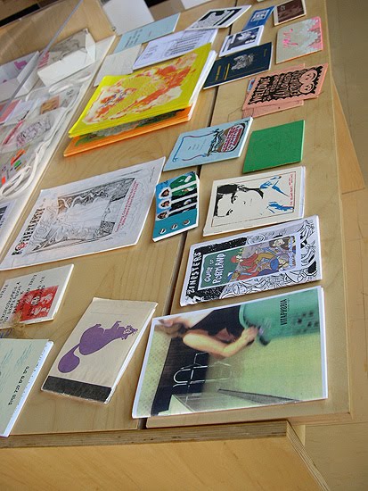
Zine case 01- colorful, fancy zines.
Zine case 2- very professional looking zine-age.
Hanging row of the great Duplex Planet zines.
More colorful Duplex Planets.
Hanging zines and tools (electric typewriter & 'pre-zine' print press).
Beer Frame- a classic from back in the day.
Artbabe!!
Stacks-o-Zines.
Event posters in WNYBAC window on the corner of Mohawk & Washington, Downtown Buffalo, NY.
Saturday morning, post opening party clean up.
BONUS BEATS- WNYBAC is a great addition to the Queen City -- they have been around for one year now. Please support this non-for-profit if you are a fan of the printed arts-- especially the antique hand-made, letter-pressed versions of book and all things printed. Become a member!

